
A dashboard built around how you think
Every coach watches different numbers depending on their sport and their own approach, so instead of handing you a generic report, Wyder lets you build the view yourself. From an athlete's Training metrics tab, drag and drop graph panels and text panels onto a resizable canvas, placing them wherever makes sense to you, and give each graph its own title and time range. What you build is saved per athlete, so it's exactly what you'll see the next time you open their page.
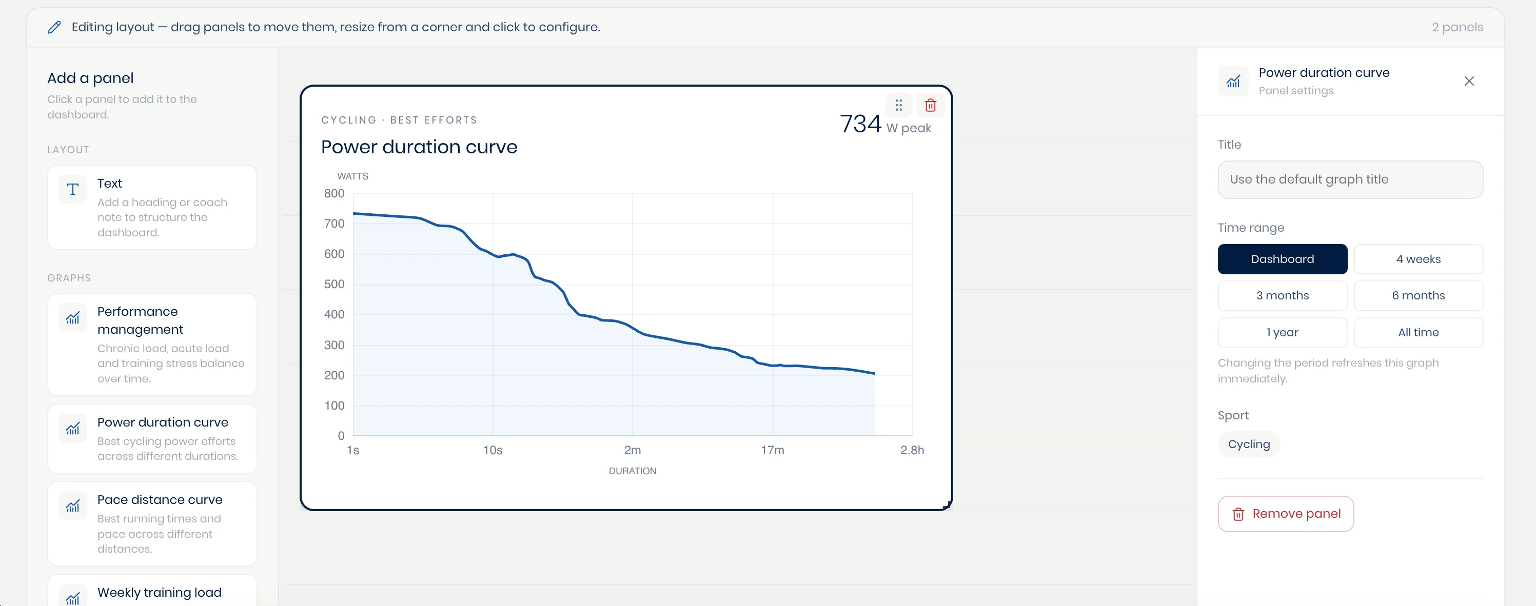
Today, Wyder allows coaches to arrange and customize a fixed set of curated graphs and visualizations. Fully custom charting, involving any metric, any comparison, and any athlete is on its way!
Visualize data with your co-pilot
While we're still expanding the capabilities of the platform's data workbench, your AI co-pilot can already generate some custom visualizations as well. Simply ask it what you want directly within the chat, and it will tell you what's already possible and what is still coming. Think of the data workbench and your AI co-pilot as complementary parts of the same data analysis toolkit.